A percentage of every purchase — not the spare change.
Microinvesting that scales with what you spend — 1–20% of every purchase, not the loose change. Built solo in five weeks: research, brand, design system, and a working prototype on live financial infrastructure.
Every screen, designed.
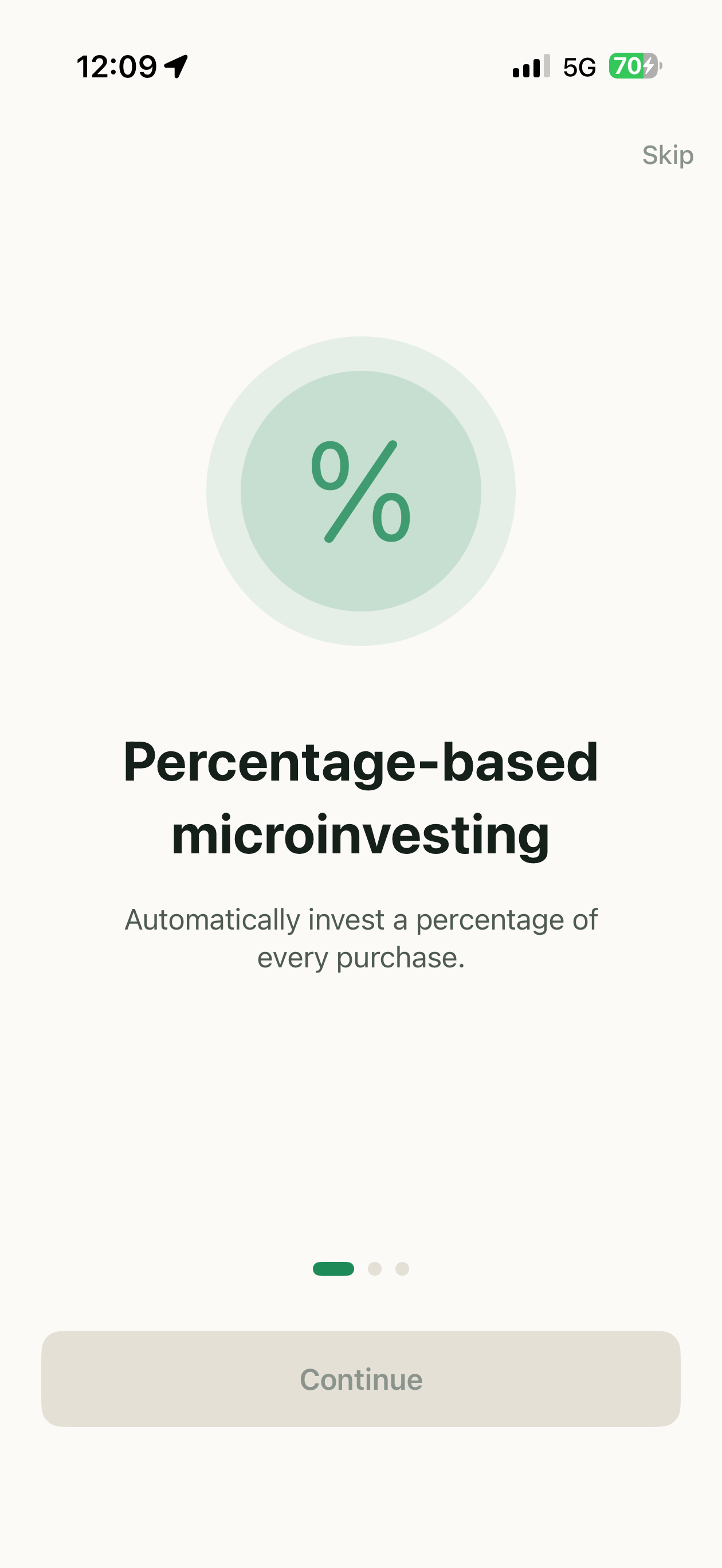
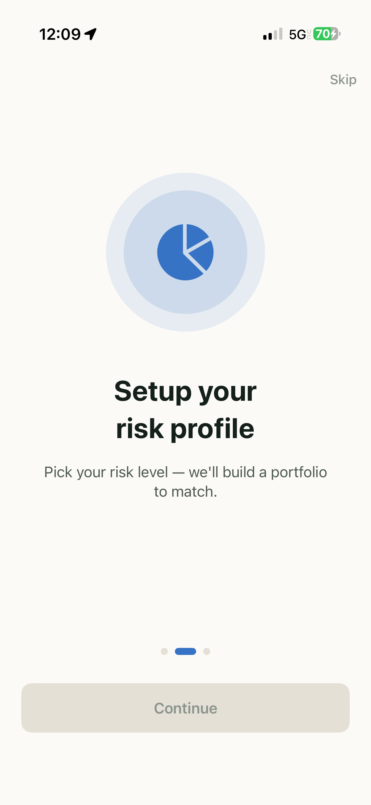
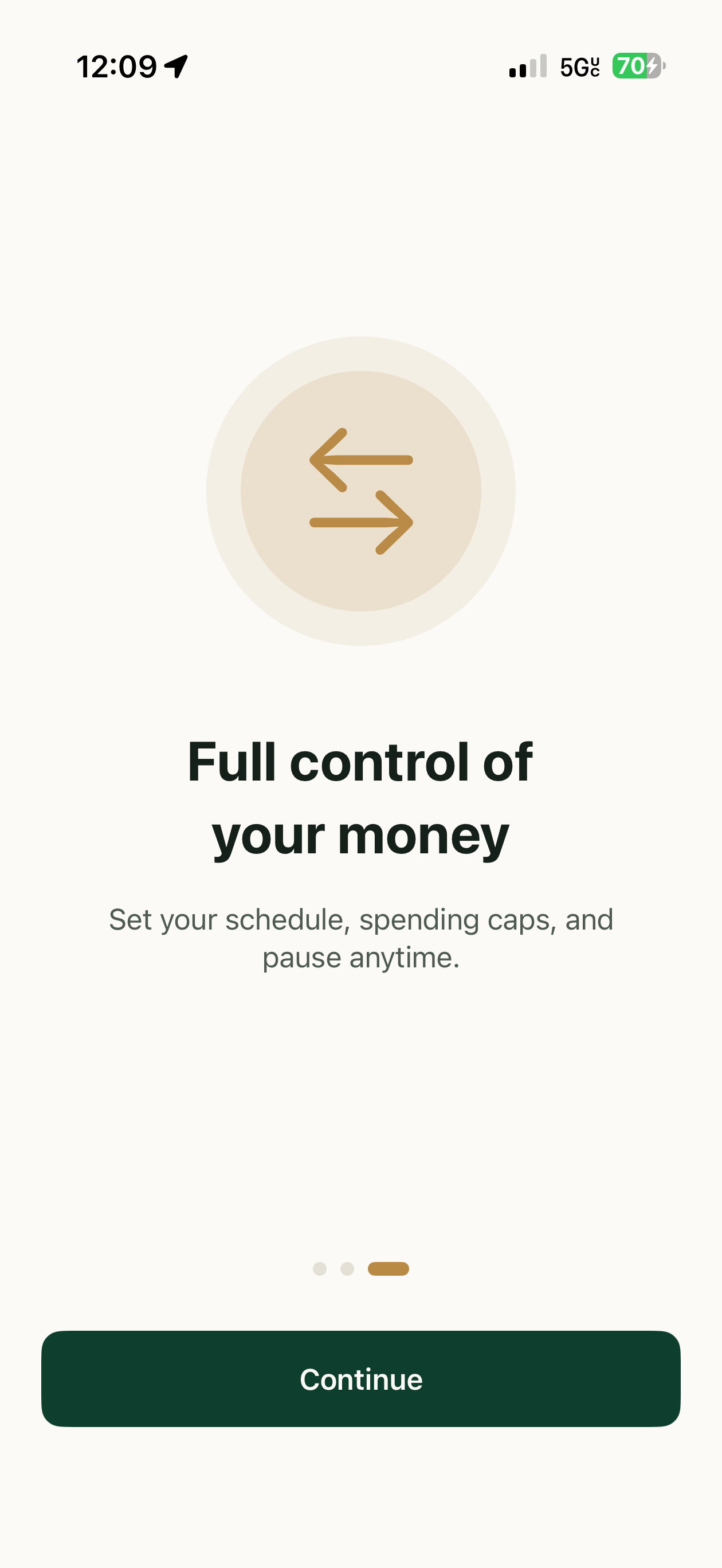
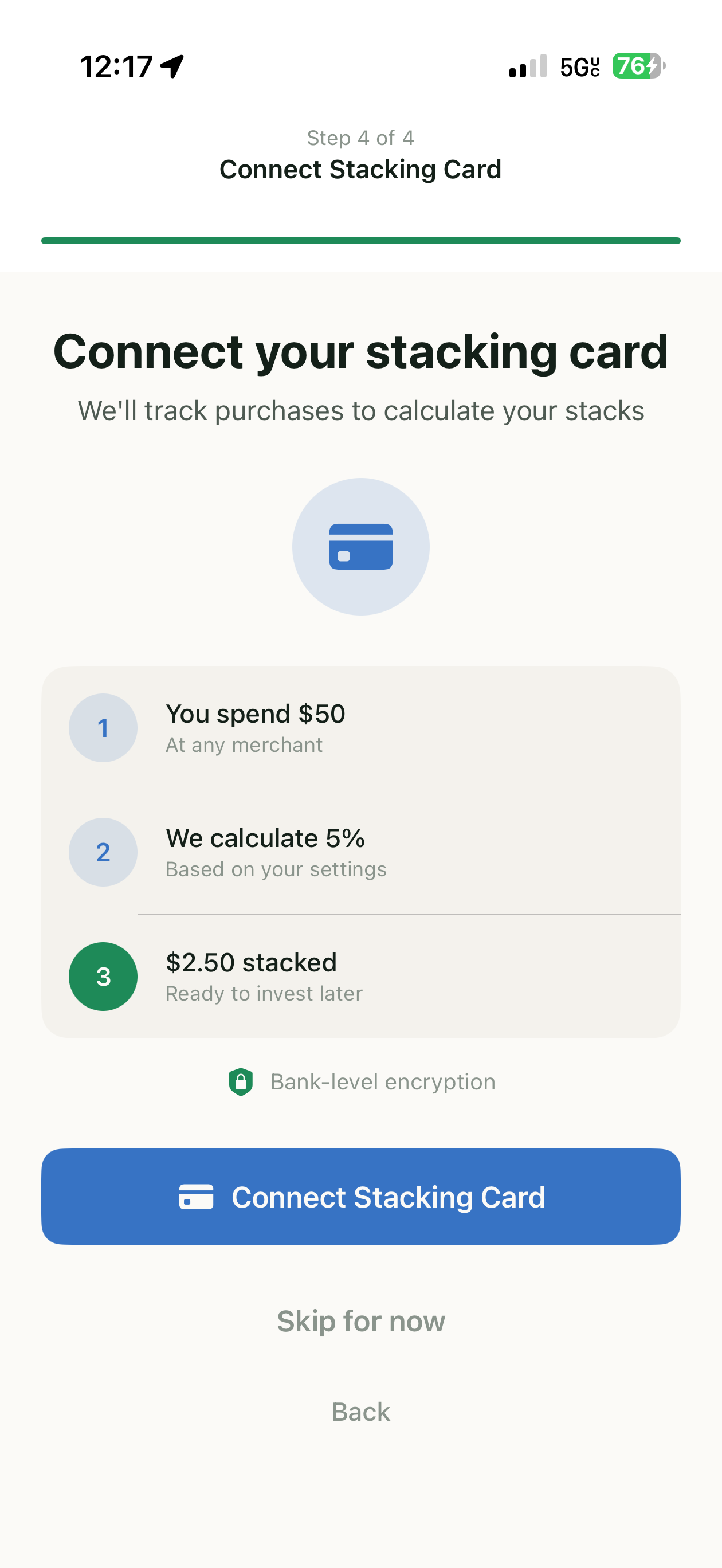
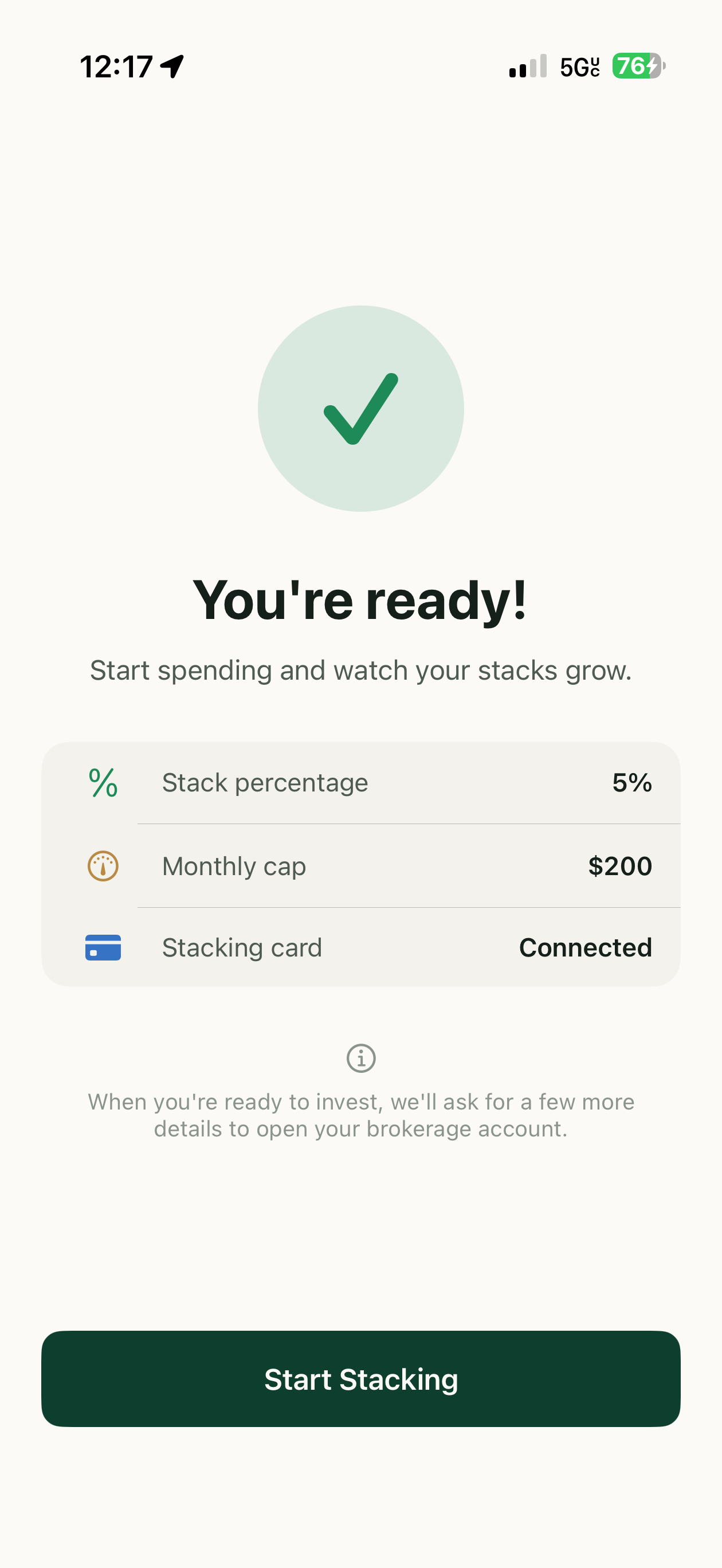
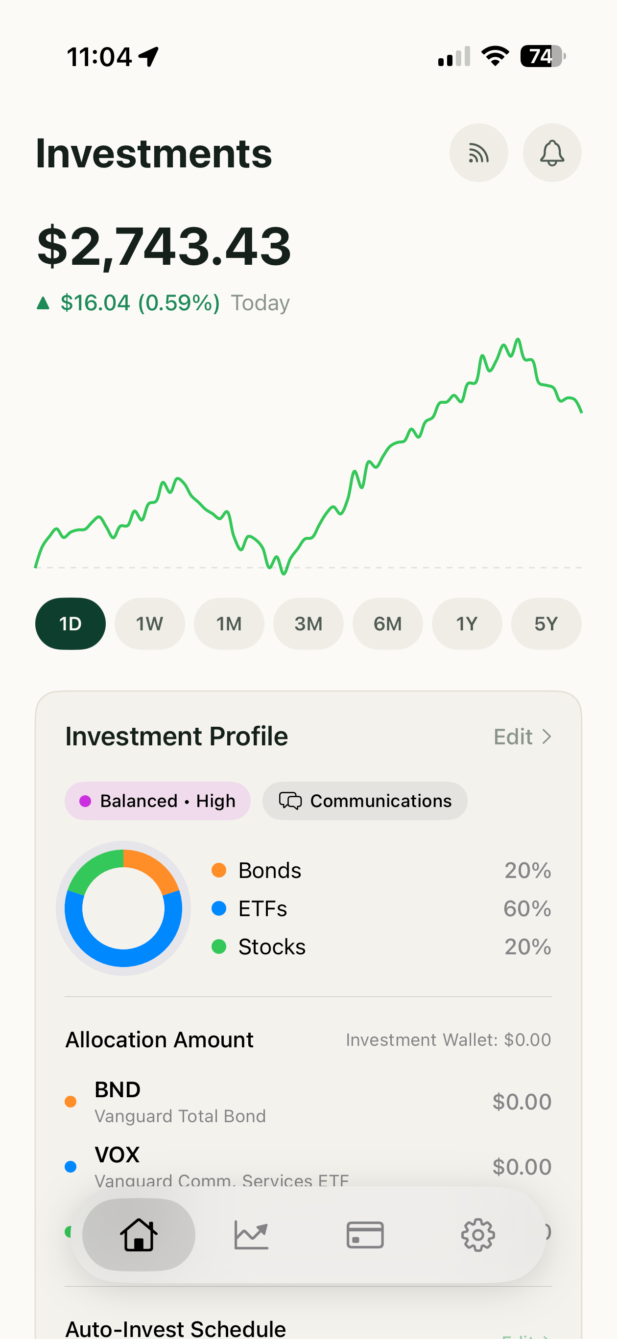
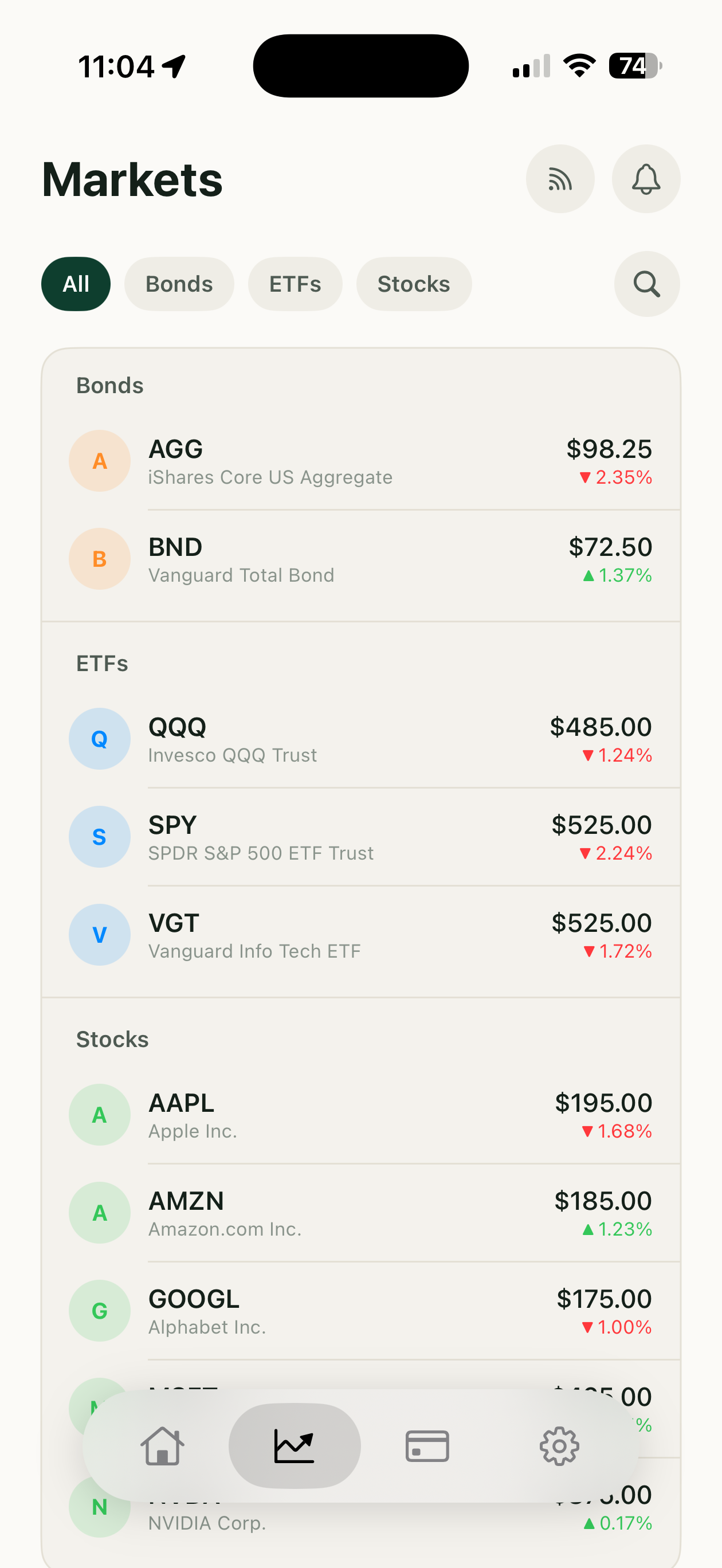
Nine screens to a first stack, thirteen product surfaces, and the verification that waits until money moves. One designer, five weeks.

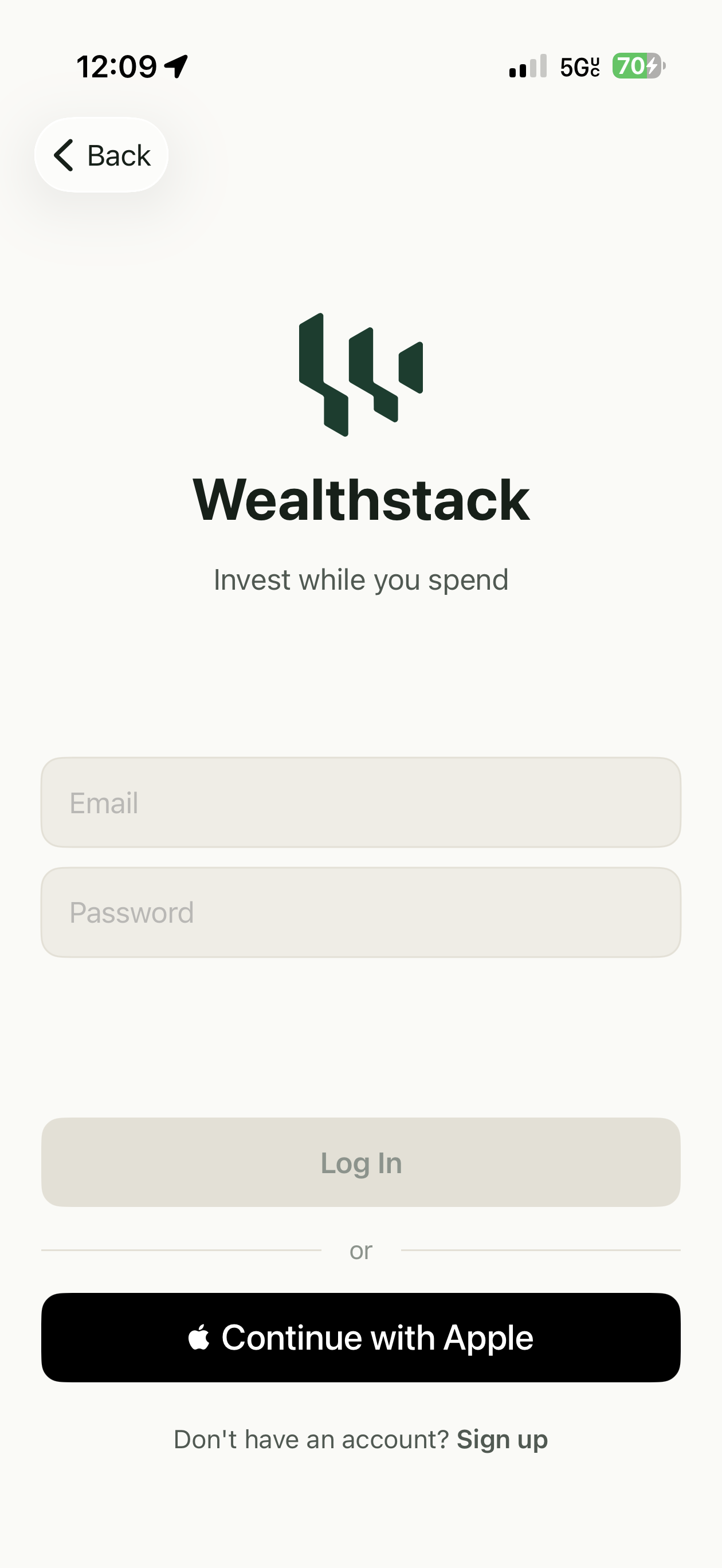
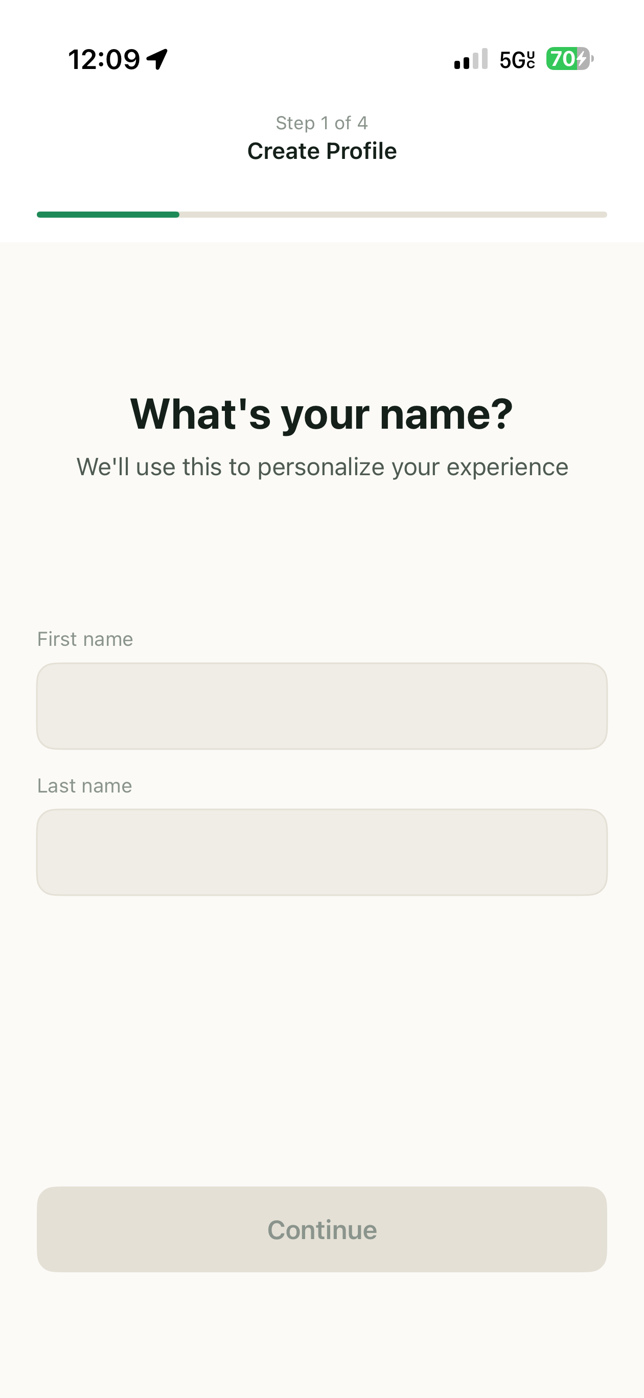
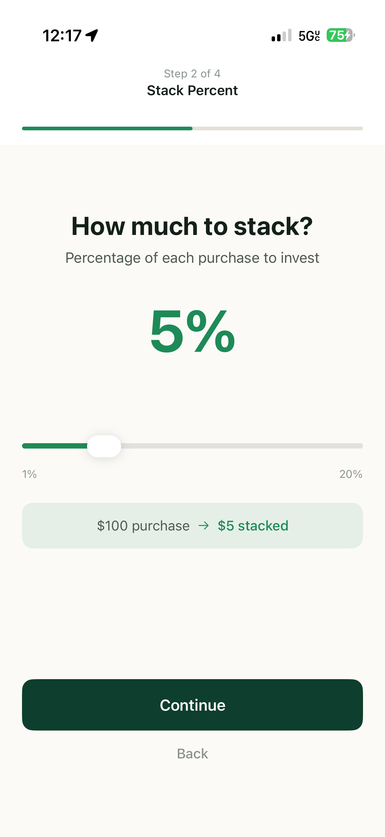
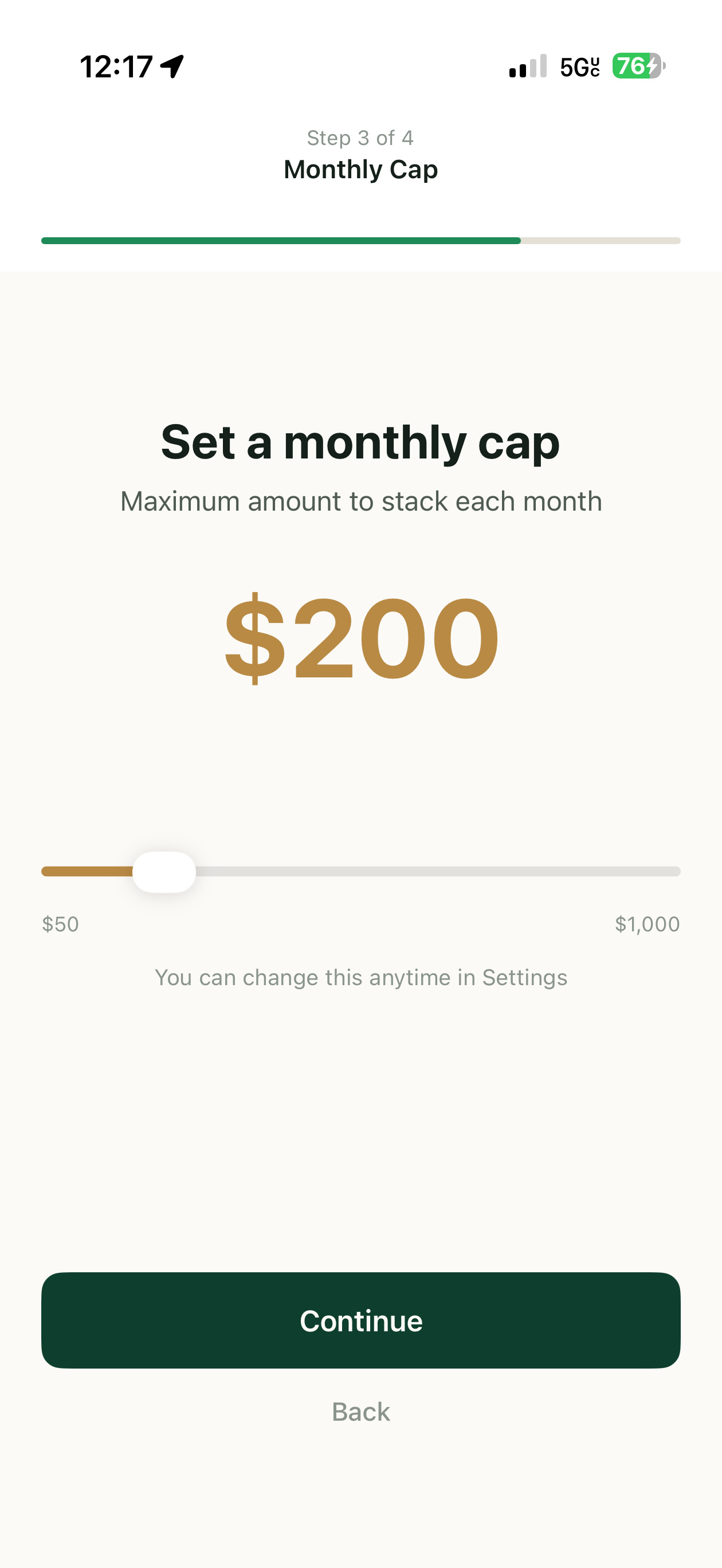
Scroll →
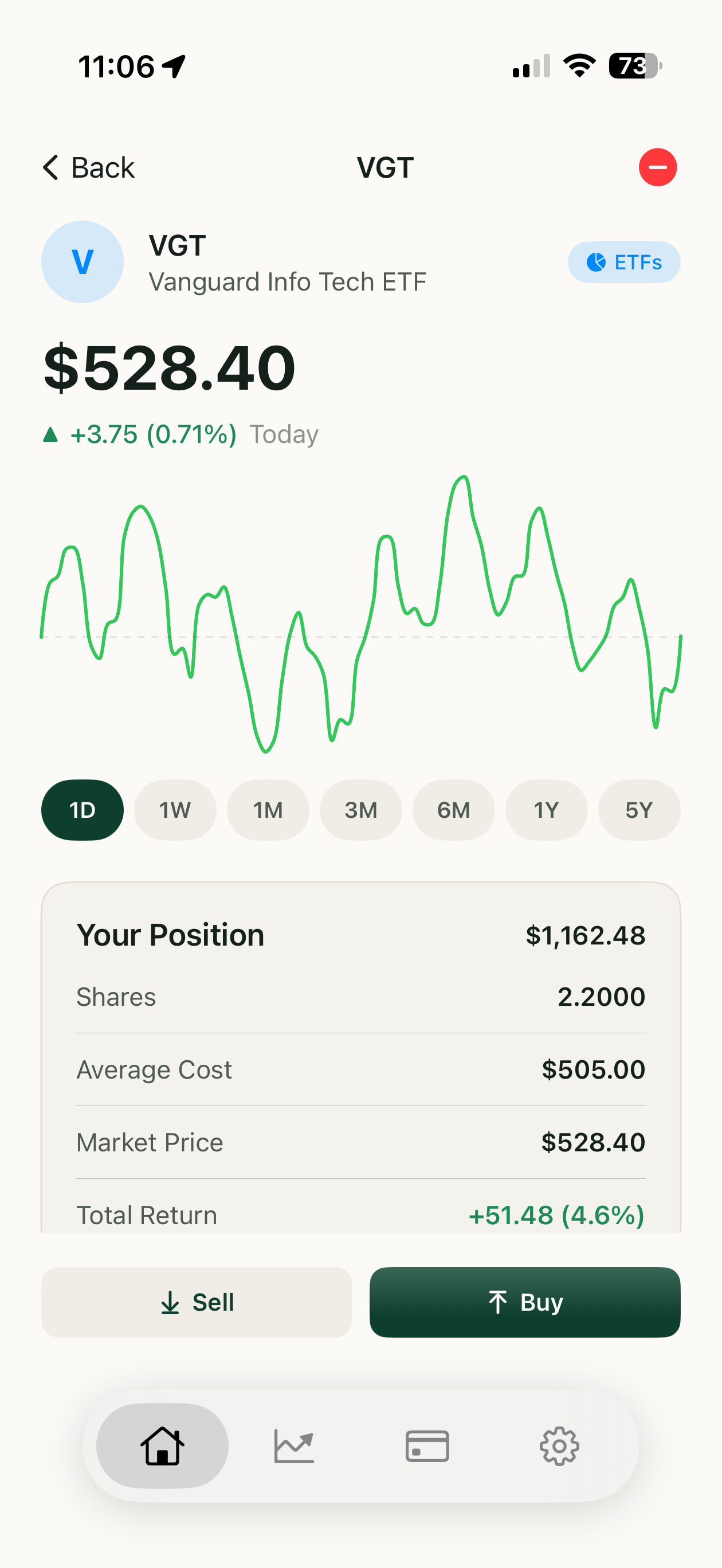
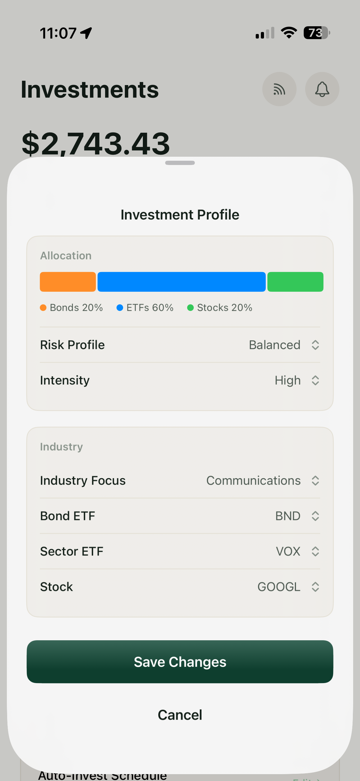
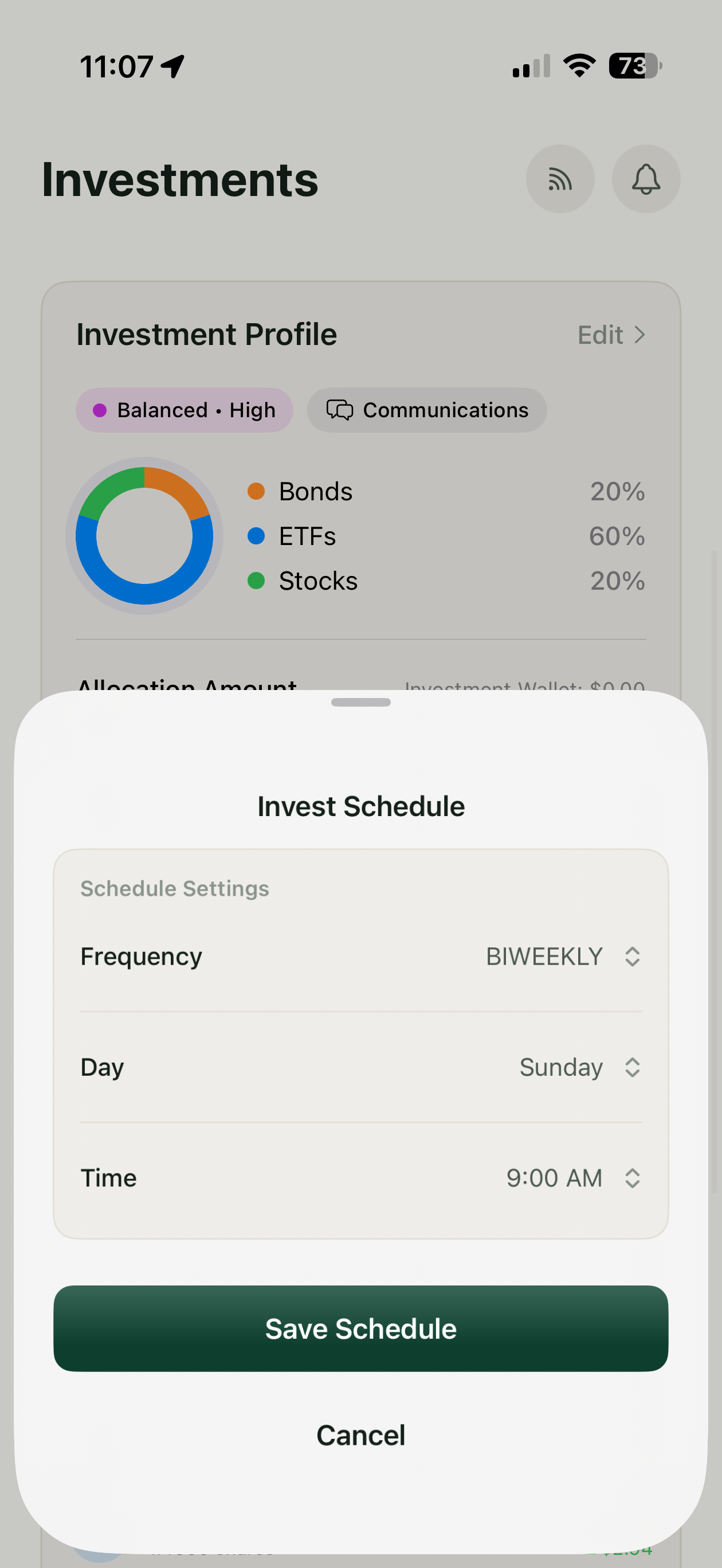
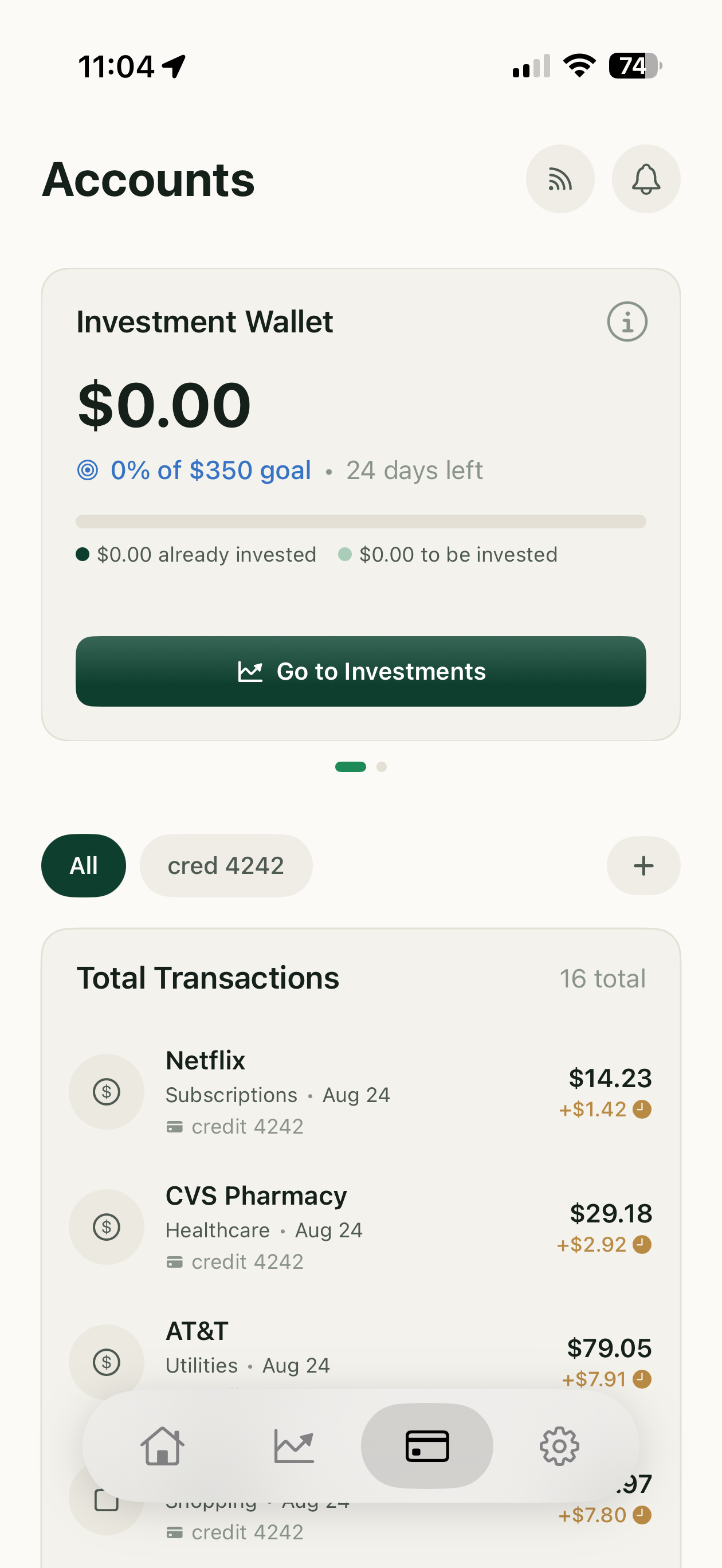
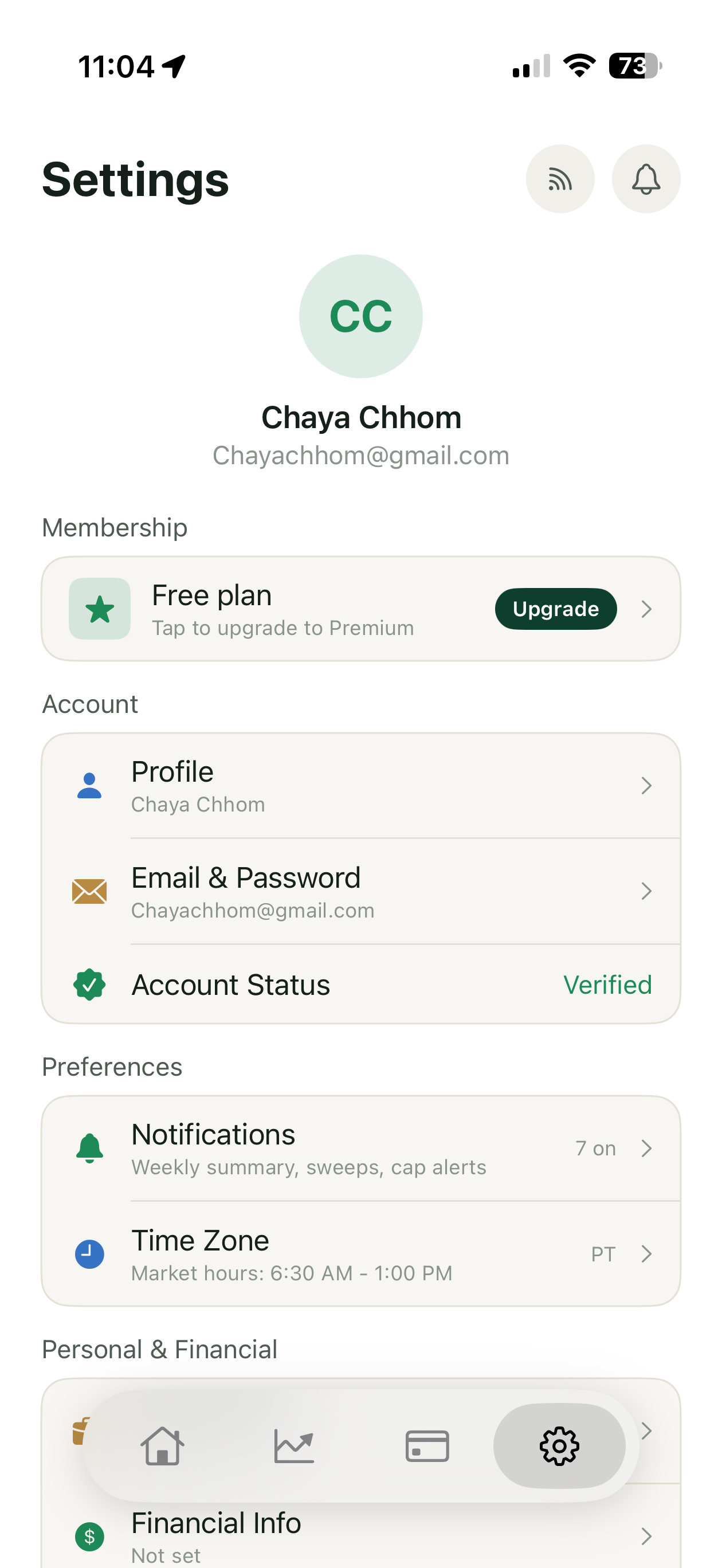
Scroll →
Round-ups count your transactions. They don't measure your spending.
A round-up is whatever it takes to reach the next dollar — so what you invest depends on how many times you tap a card, not on what you tapped it for. Buy ten small things and you invest ten times. Buy one large thing and you invest once.
| Purchase | Round-up | 1% | 5% default | 20% |
|---|---|---|---|---|
| $1.50 coffee | $0.50 | $0.01 | $0.08 | $0.30 |
| $99.50 groceries | $0.50 | $0.99 | $4.98 | $19.90 |
The round-up column is identical. Both end in fifty cents, so the dollars are discarded before the calculation starts. Every percentage column scales by 66×, matching the 66× price difference. At the low end round-ups win a cent or two — the honest trade for a mechanism that responds at all.
Both products have a range. Only one is in your control.
Acorns' range is $0.01–$0.99 per transaction — fixed in dollars. Wealthstack's is 1–20% — fixed in proportion. Put both in the same unit and the difference stops being a preference:
A 6,500× swing in effective rate, with no way to choose where you land — the cents decide. The percentage band doesn't move, and picking it is the one decision the product asks for.
A $10.01 purchase invests 99¢. A $10.99 purchase invests 1¢.
Round-ups don't just ignore the price — they run backwards to it.The ceiling isn't a policy. It's arithmetic.
Every round-up falls between one cent and ninety-nine, so a month's total is really transaction count × fifty cents. Acorns publishes the benchmark: an average of $45 a month, roughly 90 transactions. Count barely changes with income — earning more doesn't make you buy more things, it makes you buy costlier ones. The mechanism goes quiet exactly as you start to succeed.
Hold those 90 transactions constant, vary only what was spent, and put both ceilings side by side:
| Spent that month 90 transactions | Acorns round-ups | 5% $200 cap · default | 5% no cap | 20% no cap |
|---|---|---|---|---|
| $1,200 | $45 | $60 | $60 | $240 |
| $3,045 | $45 | $152 | $152 | $609 |
| $6,000 | $45 | $200 capped | $300 | $1,200 |
The Acorns column never moves. Five times the spending, same $45, and no setting raises it. Wealthstack has a ceiling too, at $200 — the difference is that it's yours: raise it to $1,000, or turn it off.
$3,045 is my own spending, not an average. The Acorns column holds transactions at 90 and the multiplier at 1×, because those are the two things that do move it — neither of which is what you spent. The cap only binds in an unusually heavy month — which is the point of putting it just above a normal one.
Answering the multiplier
Acorns lets you multiply round-ups by 2×, 3× or 10×, which looks like the answer to all of this. It isn't — a multiplier scales a number that was never connected to the purchase, so it multiplies the disconnection along with the amount.
| Same setting, two purchases | $1.50 coffee | $99.50 groceries |
|---|---|---|
| Acorns at 10× — invested | $5.00 | $5.00 |
| …as a share of the purchase | 333% | 5% |
| Wealthstack at 5% — invested | $0.08 | $4.98 |
| …as a share of the purchase | 5% | 5% |
At 10×, a coffee costs three times its own price and a grocery run costs five percent. No multiplier fixes this, because a multiplier is a constant and a percentage is a ratio. They agree at exactly one purchase size — 10× equals 5% at $100, 3× at $30 — and miss everywhere else.
Which leaves a setting nobody can reason about. Choosing a multiplier well means knowing your own average transaction size. Choosing a percentage means answering one question: how much of what I spend do I want invested?
Both automate. Neither one watches what you spend.
Acorns and Stash run the same two mechanisms between them: round the change, or move a set dollar amount on a schedule. Neither one looks at the purchase. Put all three on the same axes and the difference is a slope:
| Capability | Acorns | Stash | Wealthstack |
|---|---|---|---|
| Invests without you acting | Yes | Yes | Yes |
| Amount responds to what you spend | No | No | Yes |
| You set a rate, not a dollar figure | A multiplier, not a rate | No | 1–20% |
| Contribution grows in a heavier month | No | No | Yes |
| Monthly ceiling you choose | No | Implicit | $200–$1,000, or none |
| Budgeting built in | Limited | Limited | Yes |
Stash's Stock-Back pays up to 1% of a purchase back in stock, which reads like a percentage mechanism. It isn't the same thing: Stash pays you a percentage; it doesn't invest a percentage of your money. One is a reward funded by the merchant, the other a contribution funded by you.
The gap isn't a missing feature. Both products automate an amount with no relationship to the purchase behind it, and no setting either one offers changes that.
The person who won't start, and the person who outgrew the app that started them.
“I know a savings account isn't doing anything. I just don't know where to start.”
- Pain
- Investing is opaque. A CD is legible, so it wins by default.
- Goal
- Beat a savings account without learning a new vocabulary.
- Behavior
- Saves consistently. Has never opened a brokerage account.
“I have access to more money to invest. I couldn't make a difference on Acorns that made me stay on it.”
- Pain
- The mechanism doesn't scale, so the app quietly becomes irrelevant.
- Goal
- Put more in automatically, without turning investing into a hobby.
- Behavior
- Started on a round-up app, still has it installed, has stopped noticing it.
The graduate's complaint wasn't the interface. Round-ups pay out in transaction count, so the only way to invest more is to buy more things — a mechanism asking you to shop more in order to save more. He hadn't outgrown Acorns' design. He'd outgrown its arithmetic. And he stopped using it. That's churn, not a feature request — the mechanism didn't annoy him into leaving, it just stopped being worth keeping. This is the finding that set the top of the range in 05.
Both quotes are verbatim from sessions, not composites.
One number. It just happens to be the right one.
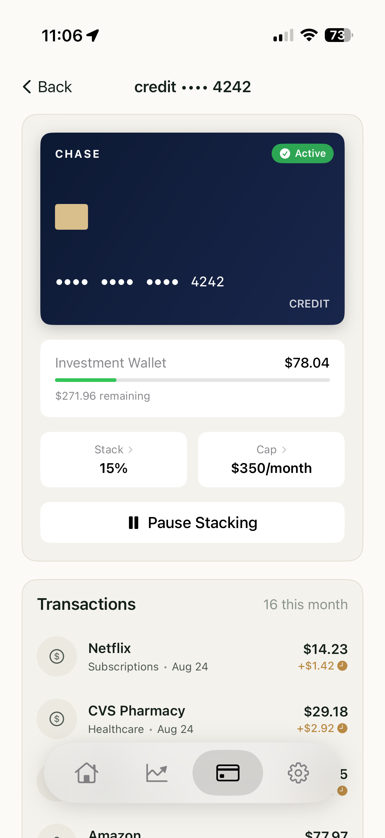
1–20% of every purchase, 5% by default, set on a slider that shows what the rate does to a real purchase as you drag it. A cap sits behind it at $200, adjustable from $50 to $1,000. Two controls at first run; the rest live in Settings.
The defaults came from asking first
Eight participants informed this section — the same cohort whose sessions are detailed in 06. The numbers below came from asking them before the rate screen existed; the findings in 06 came from watching them use it afterwards.
I asked what they spend in a normal month and checked it against published figures. Both landed around $3,000–$3,500. At 5% that's $150–175 a month against the $45 round-ups deliver — and the cap sits at $200, just above a normal month, so it catches an unusual one without binding on an ordinary one.
I also asked what they'd actually accumulated on a round-up app. Most couldn't recall a number, only that it was low. Weak corroboration rather than a finding, but it pointed the same way as the published figure.
Set the default to be felt, and let it move both ways. 5% is the amount that makes the mechanism worth having. Anyone who finds it steep can step down to 1%; anyone who wants it working harder can go to 20%. What matters is where the dial starts — defaulting low and asking people to opt into meaning is how round-ups end up at $45 in the first place.
Why the band runs to 20%
5% and a $200 cap are the defaults; the band runs to 20% and $1,000 because of the graduate in 04. His problem wasn't that round-ups were badly designed — it was that the mechanism had a ceiling he'd passed, so it quietly stopped mattering.
A 10% ceiling would have reproduced exactly that. A range that stops responding once you're doing well is the failure this product exists to fix, so the ceiling sits at 20% and the cap at $1,000 — not because most people will go there, but because the range shouldn't be the thing that runs out.
The bet, and what could break it
5% is $150–175 a month leaving checking, against $45. That's the whole proposition and its biggest risk: $45 may be less a limitation of round-ups than the reason people tolerate them. The invisibility is doing work.
The open question isn't whether the math is better — it plainly is — but whether people hold a rate once they can feel it. That's the first thing I'd test with money actually moving.
A stack isn't a transfer
Your spending earmarks an amount and the app tallies it; nothing leaves your bank until a sweep. Nothing is held, so this sits outside money transmission — and verification can wait until money moves. A tally can outrun the balance behind it: stack $37, spend down to $12, sweep fails. The app takes what's there and says so. It never overdrafts.
Every screen passed. Twice, the arrangement failed.
Eight moderated sessions on the working prototype, plus follow-up sessions on revisions. Both findings that changed the product were about order and adjacency, not any individual screen.
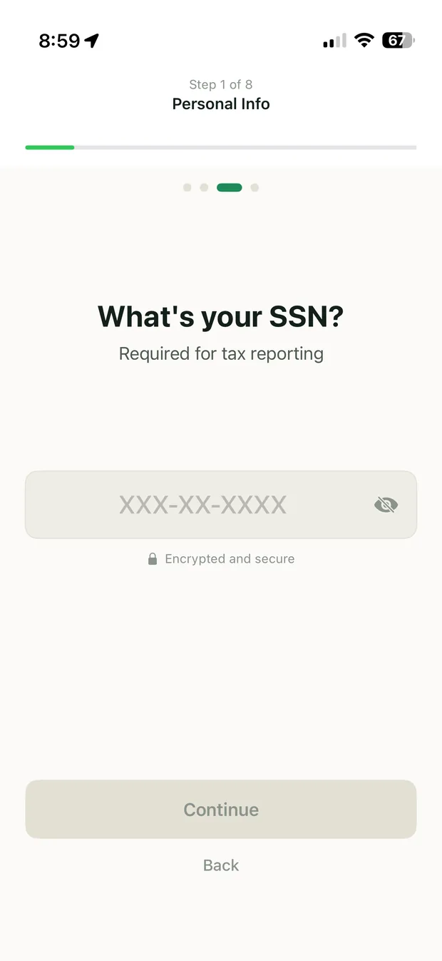
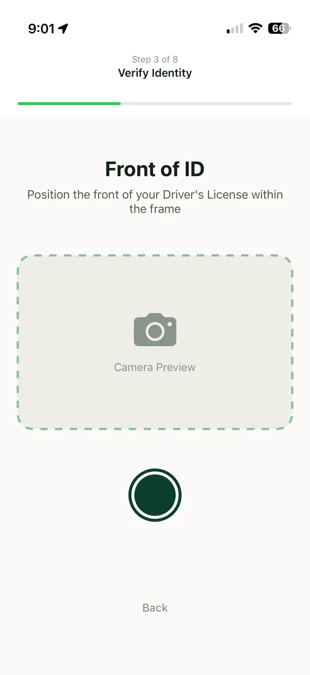
Finding one: the SSN screen was fine. Its position wasn't.
Participants understood what the screen asked. What they couldn't answer was why it was first, before the app had shown them anything it did.
"I haven't even seen what this does yet and it wants my social."
P4, 29, tested the original onboarding orderThree readings fit the data
Onboarding ran twenty-five screens and friction compounded across them, so the problem could have been volume, explanation, or position.
| Reading | The cheap fix | Why it lost |
|---|---|---|
| Too many screens | Cut fields | Volume is fixed — every identity field is required by the broker-dealer to open an account. None of them were mine to cut. |
| Screens aren't explained | Add copy | Comprehension was intact. Participants could say why an investing app needs an SSN — just not why it came first. |
| Screens are in the wrong place | Move them | The only variable left. Moving them doesn't reduce the burden — it relocates it to the moment that justifies it. |
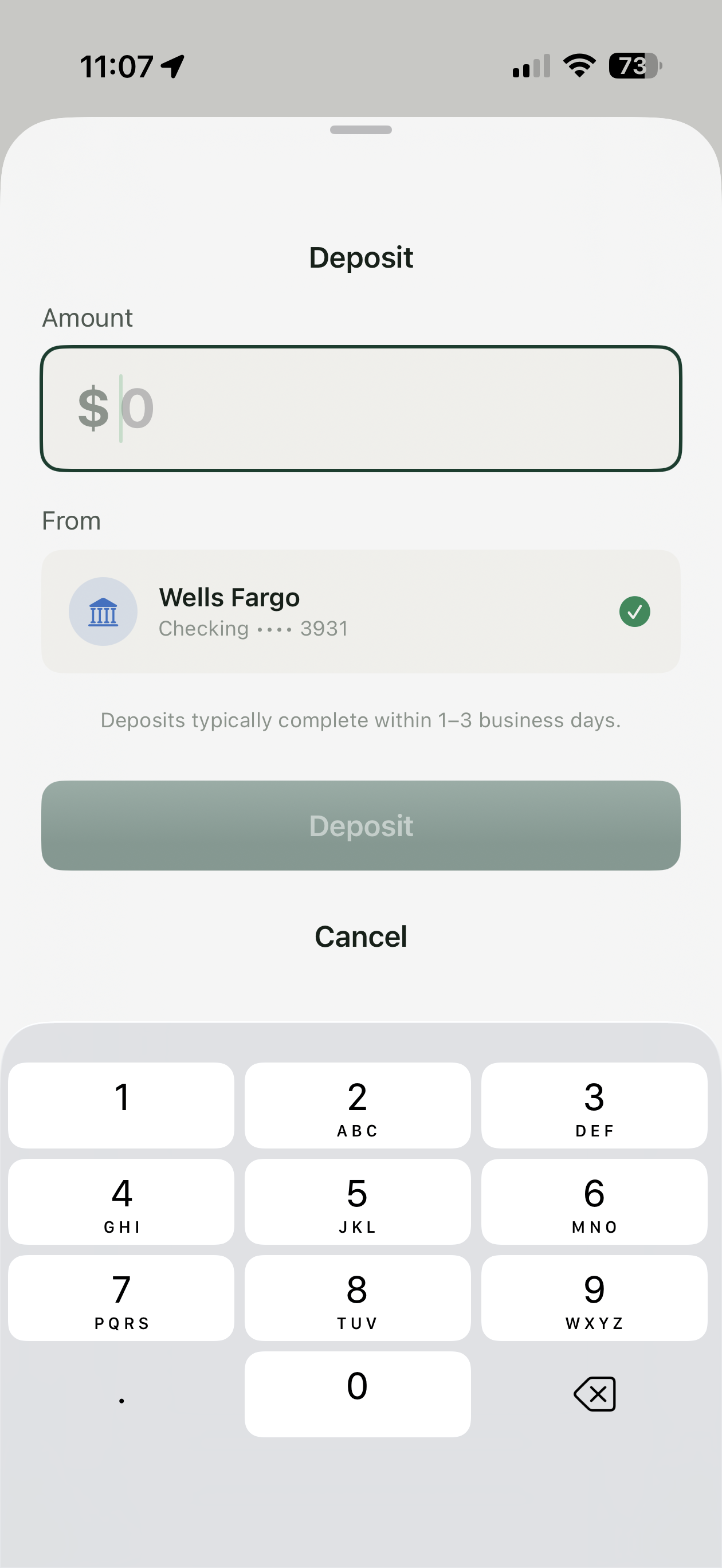
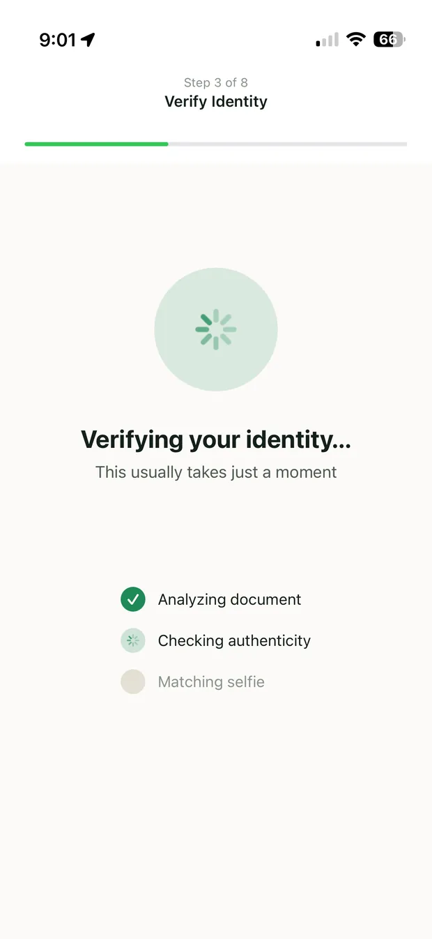
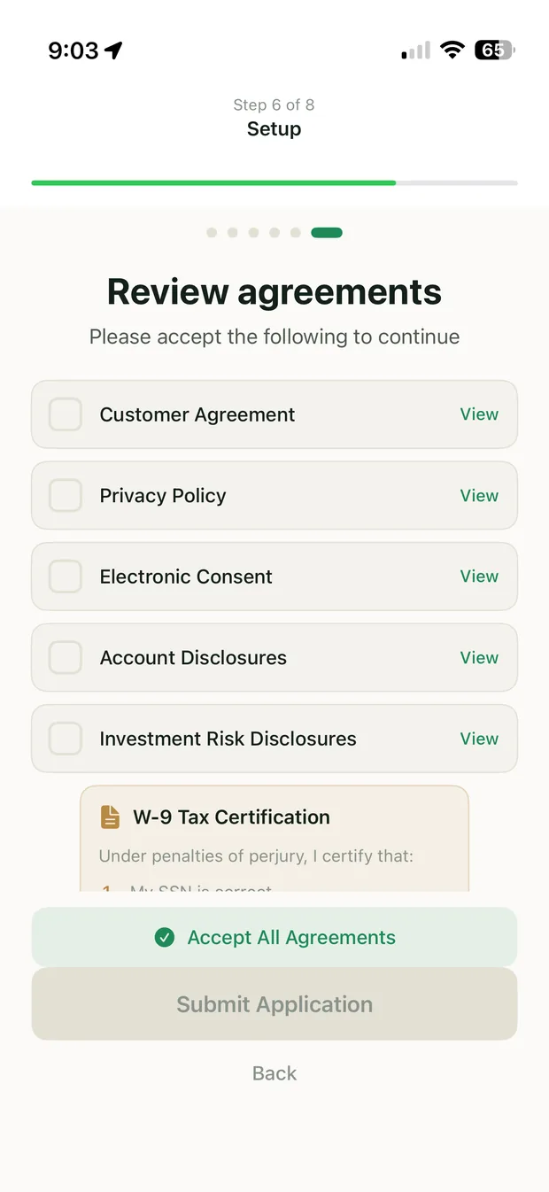
Verification moves to the first transfer, where a brokerage account must exist and the question answers its own why do you need this. Setup now ends by saying so out loud rather than leaving it as a surprise: when you're ready to invest, we'll ask for a few more details to open your brokerage account. Five returning participants walked the reordered flow. All five reached a completed stack — and none flagged the identity questions when they met them later.
Finding two: two balances on one surface read as one balance.
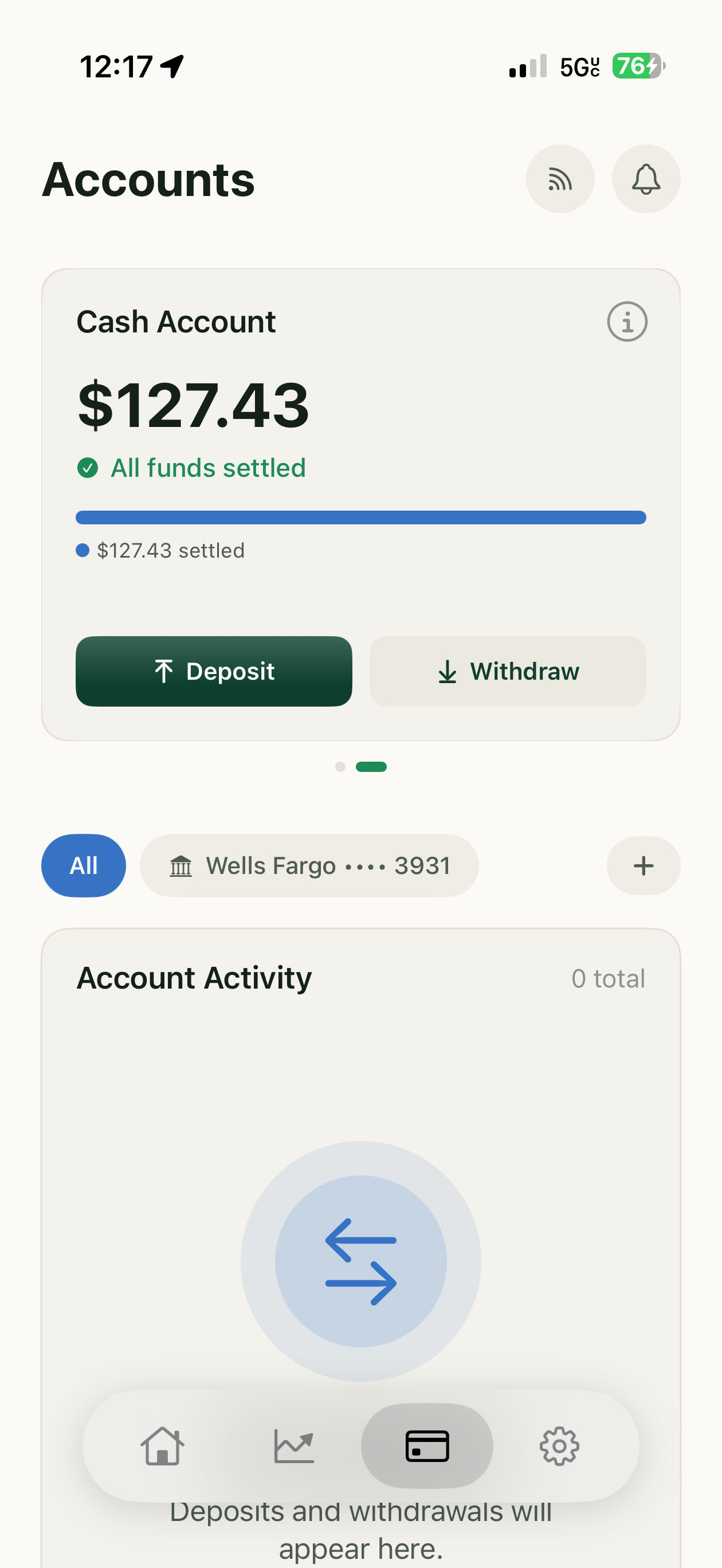
A participant on the Accounts screen couldn't tell which figure was his money. The investment wallet and the cash account sat in a single continuous component, and adjacency implied they were the same kind of money in two states. They aren't — they behave differently in the one way a user eventually cares about:
| Balance | Where it comes from | What you can do with it |
|---|---|---|
| Investment wallet | What your spending has stacked at your rate | Arrives as a sweep — buys and sells wait on settlement |
| Cash account | Money you deposited from a funding account | Already settled — buy and sell immediately |
Same dollar sign, different rules. A user who doesn't know which one he's looking at can't predict whether a trade will execute now or in two days.
One participant, and I treated it as sufficient. On a screen showing someone's money, a single user who can't identify his own balance is a defect regardless of frequency — and the settlement difference is real whether or not anyone trips on it. The session surfaced the problem; it isn't the evidence for it.
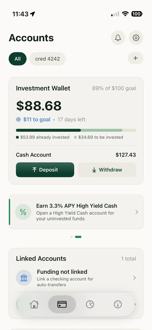
Separating them buys the room to state each one's rules instead of footnoting a merged total, and swiping makes the distinction a thing you do rather than a thing you have to infer.
Every screen comprehended fine on its own. What misled people was what I'd put next to what.
Sequence in the first case, adjacency in the second — both findings are the same mistake.Eight participants, first round; five returning participants, second round. Recruited from people who described themselves as "meaning to start investing." Not a claim of statistical significance — a small, moderated read on where a first-time user's patience actually runs out.
Four changes, and none of them were free.
Going back through the built flow, I marked every screen decided or accepted. The onboarding order was accepted — I'd never chosen it.
- Splitting onboarding
- Creates profiles that stack but never verify, and a pre-verified state to design for.
- Moving the card to last
- Trades bailing at the SSN for bailing at the bank login — just later in the flow.
- Five controls down to two
- Rate and cap survive first run. Everything else moved to Settings — so settings now live in two places.
- Splitting the wallet
- Removes the combined position from a glance, and puts a balance on a slide some people will never swipe to.
Infrastructure first, so everything downstream moved faster.
Tokens, components, a validated chart palette, and a dark mode designed rather than inverted — built before the screens.
No tickers, no confetti, no red flashing numbers. The interface should feel like compound interest, not a casino.
- Plaid
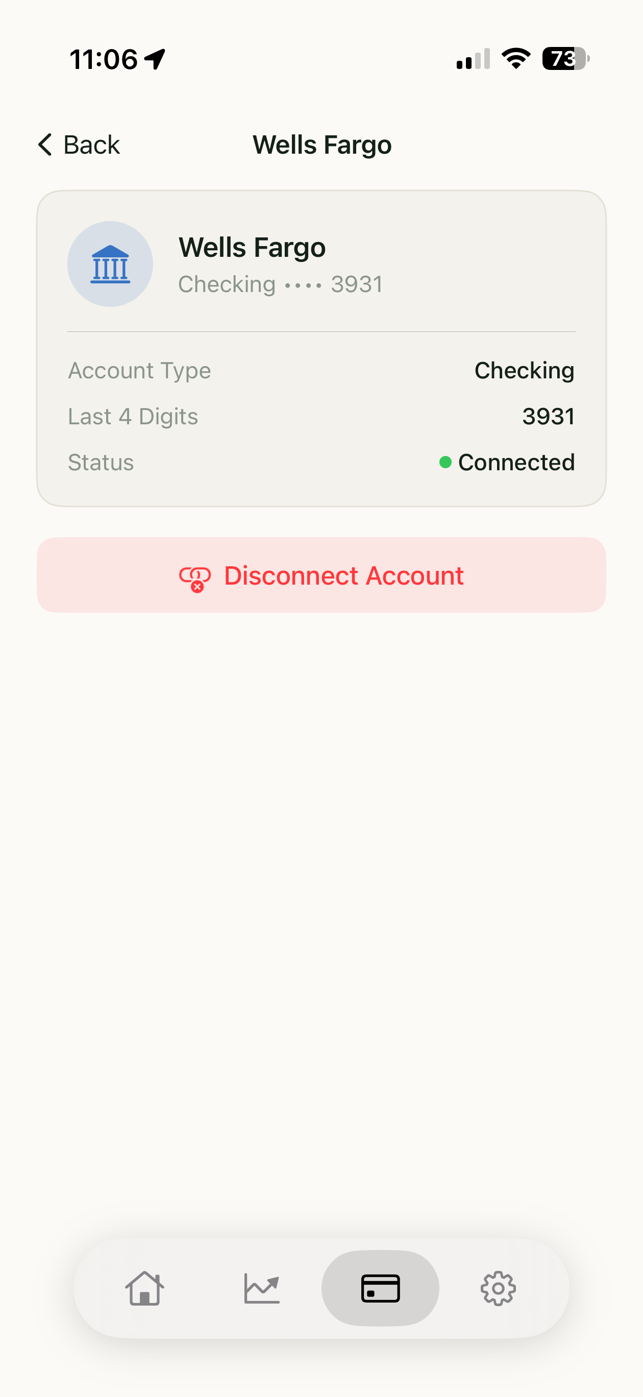
- Read-only transaction access — what makes a percentage possible at all.
- Alpaca
- White-label brokerage: account opening, KYC, fractional execution.
- Tally, not custody
- An accounting entry until the sweep. No funds held, no money transmission.
- Sandbox build
- Production runs ~$1,000/month before marketing. Too costly to test a hypothesis with.
I built a product about restraint and couldn't apply it to my own scope.
Sector tilting is the clearest miss — a control I'd criticised the category for, shipped because building it was more fun than deciding against it. A feature earns its place if it changes what the product is, not what it can do.
Solo has an obvious cost. Nothing here survived an engineer's estimate, a compliance review, or a stakeholder with a different incentive — only the infrastructure and the users told me no. What that taught me is which constraints don't negotiate: KYC requirements set the screen count, and money transmission rules are why a stack is a tally rather than a transfer. What I haven't done is defend a decision to someone who outranks me and isn't wrong.
What's next
Test the split onboarding against the old order with money actually moving. Instrument the carousel to find out whether anyone reaches the second slide. And find out what people think 5% of their spending costs them — right now, neither they nor I know.
Try Wealthstack
A working sandbox build — set a rate, connect a test account, watch a stack accumulate.